Project Overview
Walt Disney World is celebrated as the "happiest place on Earth." Annually, the entertainment-resort complex attracts 58 million visitors worldwide, making it the most visited amusement park in the world. This year Walt Disney World is celebrating its 50th anniversary. As the world reflects on all the magic, joy, and innovation Disney has brought and inspired old and young souls alike; we are left with the question of has it truly lived up to its name? Is Walt Disney World the happiest place on Earth for ALL?
Disclaimer: I am a big Disney fan and am in no way a hater :)
Timeline: November - December 2021 (6 weeks)
Deliverables: WCAG Evaluation & analysis, Personas, Cognitive Walkthrough, Prototype, Blog Post, Infographic

Our Process
WCAG Evaluation
We used the Web Content Accessibility Guidelines (WCAG) tool to review the website and ticketing process against several Success Criteria (SC) across the Levels A-AAA. Our evaluation revealed that the Walt Disney World website is not accessible and can be improved significantly to accommodate those with visual and cognitive disabilities. The website failed accessibility guidelines in several areas such as:
-
color contrast
-
consistency and visibility of navigation throughout the ticketing process
-
touch point target sizes for interactive elements
-
providing transcripts for audio-only / video-only media
-
keyboard accessibility
-
Lack of options to pause, stop, or hide moving / animated content
-
adjusting time limits during ticket checkout
Walt Disney World has always been an advocate of UX
Since its earliest conception, the Walt Disney organization has placed the visitors' experience at the heart of every creative endeavor. Marty Sklar, the former creative lead for Walt Disney Imagineering who served for 54 years, wrote out a blueprint for what should lead each designers' thought process when creating innovations for Walt Disney World, called Mickey's 10 Commandments. The visitor and their experience should be the main priority for each innovation as the first two commandments are as follows:
-
Know your audience - before beginning your design, identify your primary audience.
-
Wear your guest's shoes - Each experience created should be experienced through the lens of the visitors at every stage of design.
Persona
Disabilities do not always have to be permanent. They can be temporary or even situational. To empathize with digital users with visual impairments and cognitive disabilities, we decided to focus our attention on users who are of the age 60+. Secondary research shows that about 12% of adults over 60 experience vision loss. Therefore, older adults who wish to purchase tickets to Walt Disney World online for their families would generally need more assistance filling out forms online.

1. Improve color contrast of backgrounds & its corresponding text
The header color and CTA buttons fail WCAG guideline 1.4.3 Contrast (Minimum). Those who are visually impaired may find it hard to read text.

Before
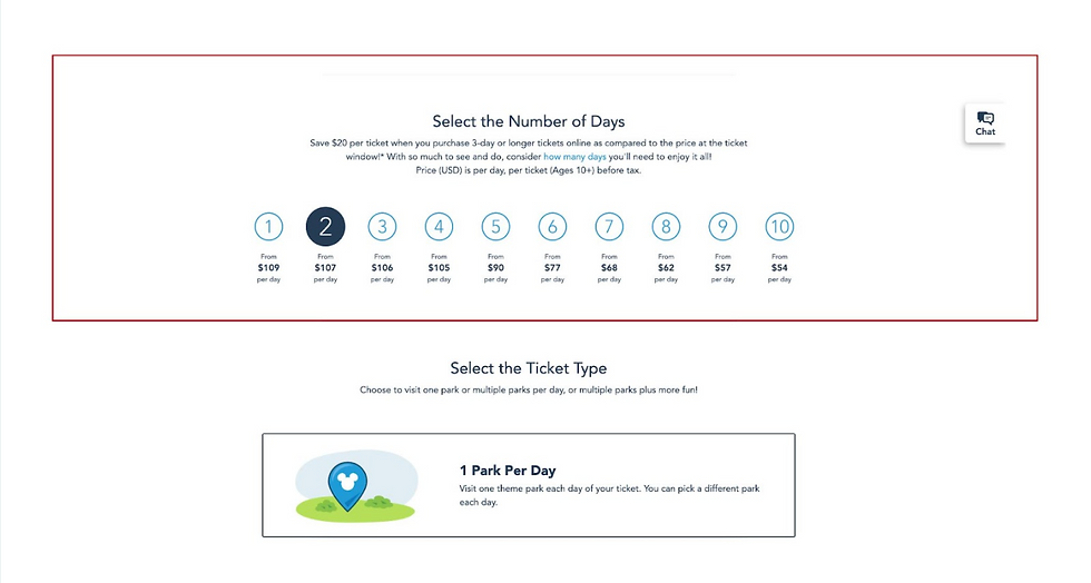
2. Reduce cognitive load / need to remember information
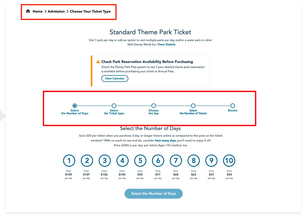
There is no information or indicator about the process for the ticketing process, which fails WCAG 3.2.3 Consistent Navigation. Breadcrumbs are used on some pages but then disappear on other pages throughout the ticketing process, also failing this guideline.
Before
We created a cognitive walkthrough to understand what pain points this type of user may encounter throughout the ticketing process. The cognitive walkthrough helped us uncover usability issues with the interface while keeping accessibility at the forefront of our minds.
Findings:
-
The ticketing process consumes too much cognitive load from senior users because of the complexity of their restrictions and rules.
-
One thing in particular that makes the process even harder for seniors is how they use small and low contrast text to describe the rules and restrictions.
Cognitive Walkthrough


Is Walt Disney World Really "the Happiest Place on Earth" for ALL? : Digital Accessibility Case Study

Challenge: Can 50 years of operation suggest that UX can be less of a priority for Walt Disney World?
The user experience seems pristine for Walt Disney World and its physical space. However, how does the User Experience for people with disabilities measure up digitally?
Goal: Identify accessibility issues on the Walt Disney World Website
Although Walt Disney World is a world-renowned company, we still sought to test its digital accessibility. We focused on evaluating the Walt Disney World Admissions page and its ticketing experience.
My Role:
-
Testing the digital accessibility against several WCAG criteria.
-
Analyzing WCAG evaluation
-
Assisting cognitive walkthrough based on our persona.
-
Writing a blog post as part of a creative initiative to discuss our research and findings.
-
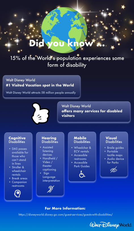
Creating the infographic of disability services offered at Walt Disney World.
-
Delivering presentation of results and proposed design changes to the instructor.
Cognitive Disabilities
-
DAS passes available for those who can't stand in lines
-
Stroller & wheelchair rentals
-
Break areas
-
Companion restrooms
Hearing Disabilities
-
Assisted listening devices
-
Handheld / video / theater captioning
-
Sign Language interpretation
Mobile Disabilities
-
Wheelchair & ECV rentals
-
Accessible restrooms
-
Accessible park guides
Visual Disabilities
-
Braile guides
-
Portable tactile maps
-
Audio device for parks
Knowing our
Audience
Although we could not quantify what percent of annual visitors of Walt Disney World have some form of disability, it is safe to assume that a large portion of visitors of Walt Disney World has a disability. Walt Disney World has many accommodations for those with a wide range of disabilities. For information about what accommodations exist, check out our infographic below!
Wearing our Guest’s Shoes

Surprisingly Walt Disney World Fails Digital Accessibility

How we can Improve the Digital Accessibility of Walt Disney World
Suggestions
-
Change the colored gradient background on the top Navigation to plain Black making the text on top of it accessible.
-
Change CTA buttons to a darker shade to increase legibility.
-
Reduced animated / image content from the ticketing hero section to guide the users directly to the main content of the website.

After
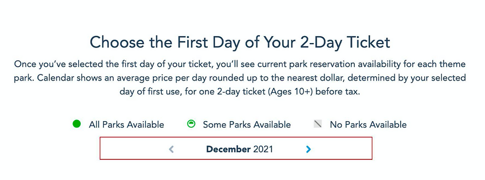
3. Increase touch point target size of buttons & make their functions known
Touch point target sizes for interactive elements like buttons are under the recommended size. This fails WCAG 2.5.5 Target Size.
Before
Suggestions
-
Use breadcrumbs throughout the entire ticketing process so users can navigate back and forth within ticketing process
-
Incorporate a progress indicator so that users know how far they are within the ticketing process / don’t have to rely on short-term memory.
After
Suggestions
-
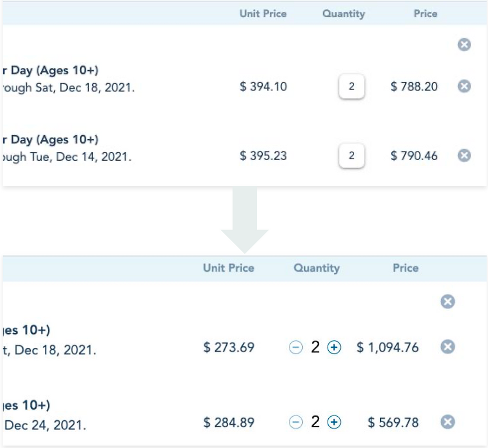
Add circles to increase the touch target size to meet 44 x 44 pixels. Doing this also improves the visibility that these arrows are buttons
-
Design increment/decrement button to change ticket quantity rather than having to input manually. Users will know that this is a button and how to change their ticket number easily.

After
Care to Learn More?
What I learned from A11Y testing
I was shocked to see that so many guidelines failed accessibility standards for a company as big as Walt Disney World. However, this study proved that any corporation, big or small, can benefit from A11Y testing. Considering users who are disabled first should be a priority for most companies. We cannot neglect this vital pool of users from our products. We must remember that an accessible world is an inclusive world for all. When Walt Disney improves their digital A11Y, only then will it indeed be the happiest place on Earth.